Is Your AI's 'Perfect' Data Visualization Actually Misleading Your Team?
AI can create beautiful charts, but are they telling the right story? Learn how to structure atomic skills for Claude Code to generate data visualizations that are statistically sound and drive clear decisions.
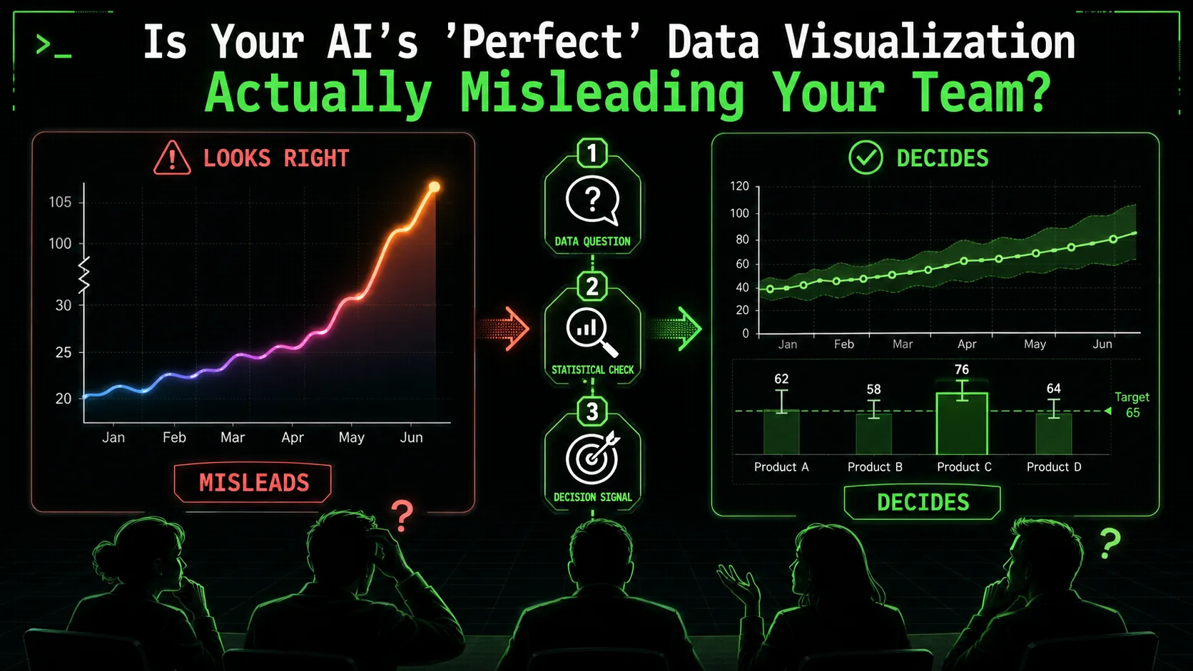
Your AI assistant just generated a dashboard. The charts are polished, the colors are on-brand, and the code is technically flawless. But when your team looks at it, they ask the wrong questions, draw the wrong conclusions, or worse, they nod along without really understanding it. The visualization is correct, but the insight is missing—or misleading.
This is the silent failure of AI data visualization. Tools like Claude Code, GitHub Copilot, and Cursor can execute code to produce any chart you ask for, but they can't judge if that chart is the right one for your data and your audience. Both Anthropic and OpenAI have focused their model capabilities on code generation accuracy, not statistical reasoning. A 2025 report by Gartner noted that through 2027, 50% of analytics content will be automatically generated, but a significant portion will deliver "context-poor or statistically dubious outputs" that erode decision quality. The problem isn't the AI's ability to plot points; it's our ability to give it the right, atomic instructions that enforce narrative clarity and statistical integrity.
What Is AI Data Visualization, Really?
AI data visualization uses Claude Code, GPT-4, or Cursor to generate charting code from natural language, but the AI handles technical execution while statistical judgment remains entirely your responsibility.
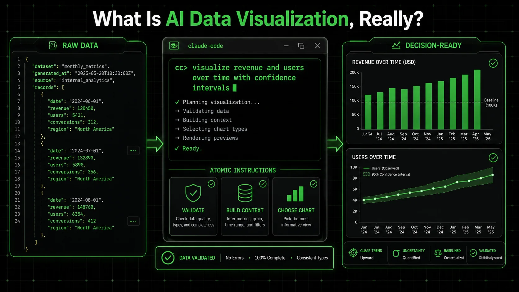
AI data visualization is the process of using an AI agent, like Claude Code, to write and execute the code needed to transform raw data into a visual format. It means you describe what you want to see—"a line chart of monthly sales"—and the AI generates the Python (with Matplotlib or Plotly) or JavaScript (with D3.js or Chart.js) to make it happen. The core value is speed and accessibility; you don't need to be a full-stack data engineer to get a chart.
However, this process has two distinct layers: the technical execution and the analytical judgment. The AI excels at the first layer. It will perfectly execute plt.plot(x, y). It fails, by default, at the second layer. It won't stop to ask if a pie chart with 15 slices is readable, or if starting the y-axis at 50 instead of 0 dramatically exaggerates a trend. This gap is where misleading visuals are born. For a deeper look at structuring effective AI interactions, our guide on AI prompts for solopreneurs breaks down the fundamentals of clear instruction.
To understand the scope, let's compare the traditional workflow to the AI-agent-assisted workflow:
| Task | Traditional (Manual) | AI-Agent Assisted (e.g., Claude Code) |
|---|---|---|
| Data Wrangling | Write custom Python/Pandas scripts. | Instruct AI to "clean this dataset, handle nulls, and format dates." |
| Chart Creation | Manually code charts, debug libraries. | Instruct AI to "create a comparative bar chart of Q1 vs Q2 revenue by region." |
| Statistical Check | Researcher must remember to check. | Can be baked into the prompt as a mandatory atomic task. |
| Narrative Flow | Built in slide decks or BI tools. | Instruct AI to "annotate the peak with a callout and order charts to tell a story." |
How does AI like Claude Code actually create a chart?
AI creates a chart by interpreting your natural language request, writing the corresponding code in a suitable library, executing that code, and returning the image or interactive output. Whether you use Anthropic's Claude, OpenAI's GPT-4 with Code Interpreter, or GitHub Copilot inline suggestions, the process is fundamentally the same. When I ask Claude Code for "a line chart of website traffic from January to June," it doesn't magically draw lines. It reasons through steps: it will likely use Pandas to handle the date series and Matplotlib for plotting. It writes the code, runs it in a sandboxed environment, and shows me the result. The process is mechanistic, not analytical. It won't, unless explicitly told, choose a timeseries-specific chart type over a default one or add a trend line for context. The Google Search Central documentation on structured data emphasizes the importance of clear, unambiguous markup for machines to interpret correctly—a parallel principle for instructing AI on data visualization.What makes an AI-generated visualization "misleading"?
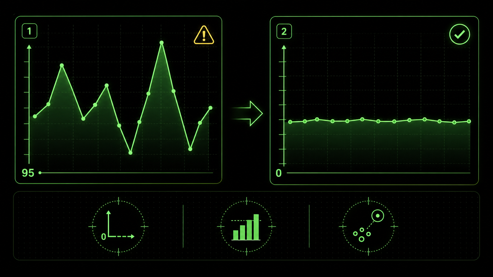
A visualization is misleading when its design, often inadvertently, distorts the viewer's perception of the underlying data, leading to incorrect interpretations. Common AI-generated culprits include truncated y-axes that magnify minor fluctuations, inappropriate chart types (like 3D pies that distort segment sizes), and a lack of necessary context (like omitting a benchmark or comparison period). The AI will happily make a beautiful 3D pie chart from your data because you asked for a "pie chart." It has no inherent concept of perceptual distortion. The misleading element isn't a bug; it's an absence of guardrails in the instruction set.Can AI detect its own statistical misrepresentations?
Not reliably on its own. Current AI models, including Claude Code and GPT-4, are not statistical reasoning engines. Research from Anthropic and Stanford's Center for Research on Foundation Models confirms that LLMs lack intrinsic numerical reasoning safeguards. They are pattern-matching and code-generation tools. They can perform a statistical test if you explicitly ask them to "calculate the standard deviation," but they will not autonomously flag that your chosen visualization violates a principle like the data-ink ratio. You must build these checks into the workflow as discrete, verifiable tasks. For instance, a task in your skill could be: "Check that the y-axis for the revenue chart starts at zero. If it does not, log a warning and justify the alternative baseline." This turns a potential flaw into a deliberate, documented choice.Why Your Team Can't Trust a "Perfect" Chart
Truncated axes, missing benchmarks, and omitted outlier context are the three most common ways Claude Code and GPT-4 produce visually correct but analytically misleading charts.
The risk isn't that the AI will calculate the sum of your sales wrong. It's that the visual representation it creates will tell a story that doesn't match reality, leading your team to make confident but incorrect decisions. This matters because visual perception is fast and persuasive; a chart carries an implicit authority that raw numbers don't.
A 2026 discussion on LinkedIn Analytics groups highlighted a surge in "automated insight" tools producing "context-poor" outputs. One data leader shared an example where an AI dashboard showed a dramatic spike in social media engagement. The chart was real, but the AI had not been instructed to note that the spike corresponded to a viral post from a celebrity—an outlier, not a sustainable trend. The marketing team almost reallocated their quarterly budget based on an anomaly.
How can a technically correct chart lead to bad decisions?
A technically correct chart contains accurate data points plotted according to the specified geometry. A good chart accurately represents the meaning and relationships within that data. The gap between the two is where decisions go awry. For example, a dual-axis chart where sales (in dollars) and customer count are overlaid can be coded perfectly. But if the scales aren't carefully chosen, it can create a false correlation, making it look like a small increase in customers caused a massive sales boom, when in reality, average order value changed. The team might then invest in customer acquisition over customer value, misdirecting resources. This is a classic failure of narrative, not calculation.What are the most common statistical traps in auto-generated visuals?
Based on my experience reviewing dozens of AI-generated reports, three traps appear constantly. First is the truncated y-axis, as shown in the image above, which visually exaggerates trends. Second is the misuse of aggregate measures—like showing only an average without the distribution, hiding critical variance. A McKinsey report on analytics pitfalls frequently cites "over-reliance on the mean" as a top error. Third is spurious correlation, where two unrelated metrics are graphed together in a way that implies causation. The AI will plot anything you ask it to; it's on you to ask for the right pairings and context. Understanding the capabilities and limits of your AI tool is key; our comparison of Claude vs ChatGPT for technical tasks explores these nuances in depth. If your broader concern is AI-generated analysis that misses the obvious, our deep dive on why your AI's perfect data analysis is missing the obvious covers the analytical blind spots in detail.Why is narrative context the missing piece?
AI generates a snapshot; humans need a story. A dashboard with five isolated charts about sales, website traffic, support tickets, social mentions, and inventory levels is just five data points. The narrative is the connective tissue: "Sales dipped in Week 3 because a website outage (Chart 2) drove a surge in support tickets (Chart 3), which was amplified on social media (Chart 4), and we couldn't fulfill orders for key items due to low inventory (Chart 5)." Without prompts to create that synthesis—through annotations, ordering, or a summary text—the AI leaves your team to do the hardest part: synthesis. And under time pressure, synthesis often gets skipped.How to Build Atomic Skills for Trustworthy AI Visuals
Engineer a visualization skill with seven atomic tasks: decision framing, data integrity checks, chart-type justification, perceptual guardrails, narrative annotations, stakeholder simulation, and final iteration in Claude Code.
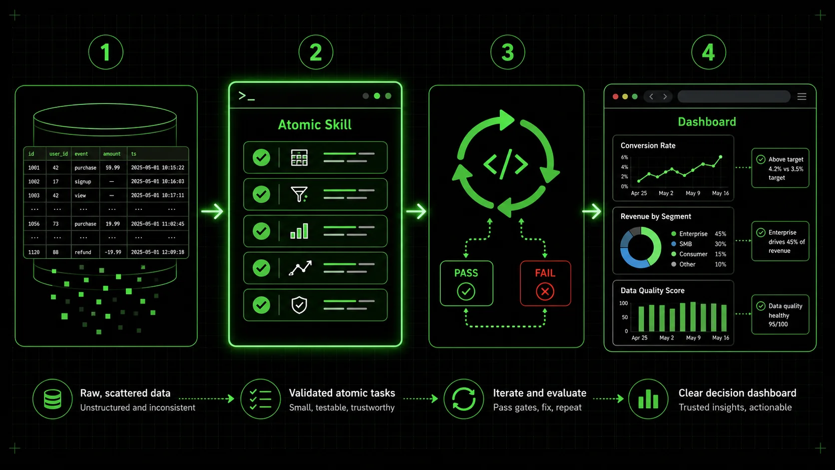
The solution is to move from asking for a "chart" to engineering a visualization skill. In the Ralph Loop system, a skill is a set of atomic tasks with clear pass/fail criteria. Claude Code iterates on each task until it passes, ensuring completeness. This method forces you to define what "good" looks like beyond just generating an image.
Here is a step-by-step method to build a skill that yields trustworthy, insightful visualizations.
Step 1: Define the single decision this visualization must support.
Before writing a single line of prompt, answer this: "What is the one decision my viewer needs to make after seeing this?" Everything flows from here. If the decision is "Should we renew our contract with Vendor A?", then your visualization must compare Vendor A's performance against a benchmark (like industry standard or Vendor B) on key metrics like cost, reliability, and support speed. This focus prevents the AI from generating interesting but irrelevant charts. Your first atomic task becomes: "Output a one-sentence statement of the core decision this dashboard is designed to inform." Pass criteria: The statement includes a specific actor, a concrete action, and the primary metric involved.Step 2: Mandate a data integrity and context check.
Your second task should lock down the data foundation. A common prompt is: "Load the dataset fromsales_q1.csv." A better, atomic task is: "1. Load sales_q1.csv. 2. Print summary statistics (count, mean, min, max, standard deviation) for all numerical columns. 3. Identify any null values and document the planned treatment (e.g., drop, impute with median). 4. Confirm the date range in the data matches the intended analysis period (Q1 2026)." Each sub-point has a pass/fail check. This surfaces data issues before they become hidden in a pretty chart.
Step 3: Specify chart type with a justification rule.
Don't just ask for "a chart." Dictate the chart type and tie it to a data logic rule. This moves the AI from a simple coder to a constrained analyst. For example: * Task: "Create a visualization to show the proportion of sales by product category." * Pass Criteria: "Use a horizontal bar chart if there are more than 5 categories. Use a pie chart only if there are 4 or fewer categories and the proportions sum to 100% of a meaningful whole. The chosen chart type must be justified in a comment based on this rule." This enforces best practices directly in the workflow. The Google Search Core Web Vitals guidelines focus on measurable user experience metrics—similarly, your pass criteria should be measurable aspects of the visualization itself.Step 4: Enforce perceptual accuracy standards.
This is where you build guardrails against misleading visuals. Create atomic tasks for specific checks: * Y-Axis Check: "For any time-series or bar chart representing absolute values, ensure the y-axis baseline is zero. If there is a justified reason to truncate it (e.g., showing small variations in a large number), annotate the chart with a note: 'Note: Axis truncated to show detail.'" * Color Check: "Use a colorblind-friendly palette (e.g., Viridis, Plasma). For categorical data, ensure distinct colors. For sequential data, use a single-hue gradient." * Label Check: "All axes must be labeled with the metric and unit (e.g., 'Revenue (USD $)'). Directly label data points or series where possible, avoiding reliance on a legend alone for more than 5 series." Claude will iterate until these concrete conditions are met.Step 5: Build the narrative through annotation and order.
Insight is delivered through context. Create tasks that force the AI to add narrative elements. * Task: "Identify the highest and lowest data points in the 'Monthly Conversion Rate' line chart. Add a text annotation at each point stating its value and a hypothesized reason (e.g., 'Peak: 5.2% - Launched email campaign')." * Task: "Order the three charts in the final dashboard layout in this sequence: 1. Top-Level Metric (e.g., Total Revenue). 2. Driver Analysis (e.g., Revenue by Channel). 3. Diagnostic Detail (e.g., Daily Revenue Trend). Generate a one-paragraph summary at the top that describes this narrative flow." This transforms a collection of charts into a coherent data story. For more on crafting layered, complex AI instructions, our repository of hub AI prompts offers structured examples. The same narrative-first approach applies to AI prompts for marketers who need data storytelling for stakeholder presentations.Step 6: Include a "sanity check" simulation.
Add a final, powerful task: "Simulate a question from a skeptical stakeholder. Based on the created dashboard, generate one likely challenging question (e.g., 'Is this growth just seasonal?') and provide a concise, data-backed answer using the visualizations." This not only tests the dashboard's communicative power but also produces ready-made talking points for your presentation.Step 7: Package and iterate on the complete skill.
Compile all these atomic tasks into a single skill, for example, "Generate QBR Executive Dashboard." The Ralph Loop Skills Generator is built for this. You input these structured tasks, and Claude Code executes them sequentially, looping on any that fail. The output isn't just a chart; it's a documented, vetted, and narrative-driven visualization asset. The table below contrasts the outcomes from a simple prompt versus an atomic skill.| Aspect | Simple Prompt ("Make a sales chart") | Atomic Skill ("Generate QBR Dashboard") |
|---|---|---|
| Output | One chart, type chosen by AI. | A multi-chart dashboard with defined layout. |
| Statistical Integrity | Unchecked. Y-axis may be truncated. | Guardrails enforced by tasks (e.g., "y-axis starts at 0"). |
| Narrative | None. Just a title. | Annotations, ordered sequence, and a summary paragraph. |
| Team Trust | Low. Team must vet everything. | High. Built-in checks are documented and passed. |
| Revision Need | High. Likely requires back-and-forth. | Low. Criteria are met before delivery. |
Proven Strategies to Elevate Your Data Communication
Confidence intervals, comparative benchmarks, A/B test templates with p-value annotations, and audience-adaptive branching turn Claude Code from a charting tool into a decision-support engine.
Moving beyond basic guardrails, these strategies leverage atomic skills to solve higher-order communication problems. They are about designing the thinking process you want the AI to emulate.
How do you visualize uncertainty and forecast ranges?
AI loves to draw a single, clean forecast line. The real world is messy. A pro strategy is to build a skill that mandates visualization of confidence intervals. A task could be: "Using the sales forecast model, plot the predicted line. Then, calculate and shade the 95% confidence interval around that line. In the chart legend, label the shaded area as 'Prediction Range.'" This forces the AI to handle statistical output and present it visually, reminding viewers that the future is a range, not a line. This directly addresses the "context-poor" output critique from industry analysts.What's the best way to handle comparative benchmarks?
A chart in isolation is hard to judge. Is 10% growth good? The best visuals bake in the benchmark. Create a task that says: "To the 'Monthly Growth Rate' bar chart, add a horizontal dashed line representing the industry average growth of 7% (sourced from [Industry Report 2025]). Color bars that exceed the benchmark green and bars that fall below it red." This turns a monologue into a dialogue with a standard. It also demonstrates the value of integrating external data sources into your AI workflow, a step beyond just visualizing internal data.Can you automate A/B test result visualization for clarity?
Yes, and this is where atomic skills shine. Instead of asking for "charts from the A/B test," build a skill with a strict template. Key tasks would include: "1. For the primary metric (e.g., conversion rate), create a paired bar chart showing Variant A and Variant B with their 95% confidence interval error bars. 2. Calculate the relative lift and p-value. 3. If p-value < 0.05, annotate the chart with 'Statistically Significant.' If not, annotate with 'Inconclusive.' 4. Create a secondary chart showing the daily trend of the metric for both variants to check for interaction with time." This ensures every A/B test visualization is consistent, statistically sound, and immediately interpretable, eliminating debate over what the results "mean."How do you tailor the same data for different audiences?
The CEO, the marketing manager, and the data engineer need different views of the same data. This audience-adaptive approach mirrors how AI prompts for product managers structure outputs differently for executives versus engineering teams. Build a single master skill that branches. The first task is: "Identify the target audience: Executive, Manager, or Analyst." Subsequent tasks then conditionally execute. For an Executive, tasks focus on high-level trends, big numbers, and strategic annotations. For a Manager, tasks drill into department-specific drivers and actionable metrics. For an Analyst, tasks include showing data distributions, regression lines, and raw data tables. This approach uses one data source and one skill to generate three purpose-built dashboards, ensuring alignment without manual rework.Got Questions About AI Data Visualization? We've Got Answers
Can AI choose the "best" chart type for my data? It can make a suggestion, but you shouldn't fully delegate this choice. AI can analyze your data's structure (e.g., it's categorical, time-series) and recommend a common chart type based on patterns in its training data. However, the "best" chart is determined by your specific communicative goal, which the AI doesn't inherently know. A more reliable method is to define rules within your atomic skill, as shown in Step 3, where chart selection is tied to data properties and your pre-defined narrative goals. How do I know if my y-axis is misleading? There's a simple rule of thumb: For bar charts and line charts that represent absolute quantities (like total sales, number of users), the y-axis should almost always start at zero. Starting anywhere else visually exaggerates differences. The only common exception is when you're showing small variations on a very large number (like daily fluctuations in a stock price), and you must annotate the chart clearly to indicate the truncated axis. Your atomic skill should encode this rule as a pass/fail check. My team finds dashboards overwhelming. Can AI help simplify them? Absolutely. This is a perfect use case. Instead of asking the AI to "show all the metrics," build a skill where the first task is to identify the top 3 Key Performance Indicators (KPIs) that correlate most strongly with the primary business goal, using a defined statistical method (like correlation coefficient). The subsequent tasks then visualize only those 3 KPIs with deep context. The AI isn't just plotting; it's executing a filtering and prioritization protocol you designed, reducing noise and focusing on signal. Is this approach only for Claude Code, or can I use it with other AI agents? The core philosophy—breaking down a complex task into atomic steps with verifiable criteria—is universal. While the specific syntax for tasks and iteration might differ, the mental framework applies to any AI agent that can follow sequential instructions and check conditions, such as OpenAI's GPT-4 with Code Interpreter, GitHub Copilot with a detailed issue ticket, or Cursor's composer. The Ralph Loop system formalizes this for Anthropic's Claude Code, but the strategy improves prompt engineering anywhere. For a thorough guide on structuring any prompt for maximum output quality, see our prompt engineering guide.---
Your AI is ready to be more than a chart-making machine. It can be a partner in building clear, trustworthy, and decisive data communication—but only if you provide the structure. The difference between a misleading graphic and an insightful one isn't better AI; it's a better brief.
Stop hoping your next prompt will magically work. Start building the atomic skill that guarantees it will. Generate your first visualization skill now and turn your next data review into a decision-making session, not a decoding exercise.
<!-- sister-projects-start -->
Other Doved Studio projects
Related tools from the same studio you might find useful:
- Glean: Turn scrolling time into a daily action plan. Capture, process, execute.
- Popout: Create your portfolio in minutes with a single shareable page.
- Larpable: Spot fake founders, guru grifts, and performance entrepreneurship.
- Doved Studio: Studio indie derrière cette app et une dizaine d'autres outils.
ralph
Building tools for better AI outputs. Ralphable helps you generate structured skills that make Claude iterate until every task passes.